13.3 - Tables and Charts
Links and useful resources
- gr7's Prealgebra Course Outline START HERE<<<
- AoPS Online Textbook
- IXL Grade 7 index
- IXL Grade 8 index
- AoPS Alcumus
- IXL prealgebra practice index
- OpenSTAX Prealgebra-1 textbook
Types of charts
Tables
- Useful when there are two independent variables and one dependent. For example: you might make a table of elevation data, where the row is the north-south coordinate, the column is the east-west coordinate, and the value in the cell is the average elevation for that area.
- Columns and rows can also represent functions that are computed over the data, like a column for the average value of each row, or a row for the total value of each column
!Pasted image 20250331073506.png
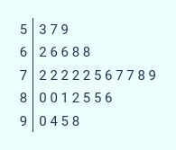
Stem-and-Leaf plots
- This is basically a shorthand for writing lists of numbers: you write the leading digit(s) to one side of a bar, then write the units digits of each off to the other side in a list
- Works like a histogram, where the bins cover ten values each
- The lists of digits to the right show which tens-digits are the most common
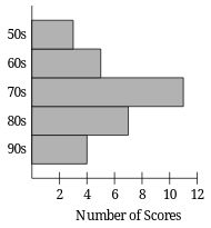
Histogram
- Use when you have a lot of samples of something and you want to see how they're distributed through all of the possible values
- Create a bunch of "bins", which are ranges of value that you're going to treat as one group
- Set the height of the bar for each bin based on the number of samples that fall in that range
- The heights of the bars tell you how common it is to find a value in that range.
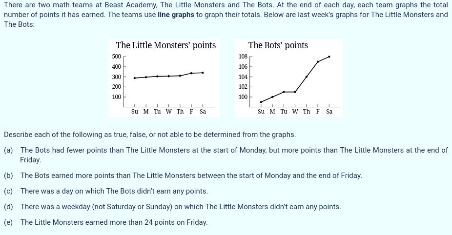
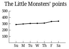
Line graph
- A line graph is useful to see how something is changing over time (or some other value that has a smooth range, like distance)
- Each line represents a sequence of values for a single measured thing (like your height every year, for example)
- Plot a dot for each sample so that the y-axis coordinate is the value, and the x-axis coordinate is the time, then connect the dots with a line.
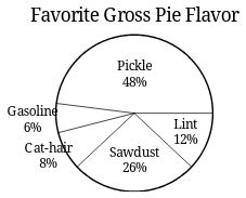
Pie Chart
- Pie charts are good for showing how something is divided up into different categories or parts
- Each sector in the chart is scaled so that its angle is proportional to the relative amount for that value compared to the total for all values
- It gives you a visual representation to see quickly what's taking the biggest fraction, and how many there are.
Guided practice